
3 Wrongs (Breaking the Photographic 'Rules')
- Chris Hilton

- Nov 22, 2025
- 9 min read
Updated: Nov 23, 2025
We are going to have an evening coming up at the club where we will be invited to present some of our own pictures that take three photography rules, then break them ... but first we're going to decide which rules we're going to break.
Intially, it was going to be ten but after a discussion night we settled on eleven because one just kept on coming up and it would be churlish to leave the list at ten ... after all, they're not commandments!
1 ... Never Shoot into the Sun
2 ... Keep the Horizons Straight
3 ... The Rule of Thirds
4 ... Use Leading Lines
5 ... Leave Space for an Object to Move into
6 ... The Subject Needs to be in Focus
7 ... The Background Needs to be Sharp
8 ... Don't Blow the Highlights
9 ... Don't Block the Blacks
10 ... Use a Standard Crop and a Standard Form of Mounting or Presenting Your Image
11 ... Don't Cut Body Parts Off with the Edge of the Frame (especially heads)

The title of your competition entry should correspond to the rules you are breaking. For example, this picture is shot into the sun, with a wonky horizon and an out of focus subject (the bus). to enter it, it would need to be be titled 1,2,6. It was, in fact, this picture that started it all off ... when a member saw it at the club they remarked that we should have a competition where we do everything wrong! So here it is!
Now a quick explanation of what those rules are so we really know how to break them.
Remember what Picasso said ...
Learn the rules like a professional ... break them like an artist
1 ... Never Shoot into the Sun

It was a rule designed by the people that used to develop your films as shooting into the sun was more likely to cause the amateur photographer problems, which might make poor prints, which might look bad on the developer ... better to shoot with the sun at your back and get bright, colourful photographs.
However, shooting into the sun for the likes of Fan Ho and others has produced some wonderfully evocative images.
Shooting into the sun has produced a soft, delicate light that subtely describes the shapes of the people descending the staircase. Note the light in the hair and the rim lighting around some of the peoples limbs. A rule, I think, that should be broken as often as possible.
It can also be used to create a much more contrasty effect with silhoettes that have gone completely black.
2 ... Keep the Horizons Straight

Tilting the camera first came to prominence during German Expressionist cinema a hundred years ago ... now known in the film industry as the Dutch Angle (which likely came about as a bastardisation of the word Deutche meaning German). Beloved of the horror film or pyscological thriller it was used extensively by the likes of Hitchcock and Tarantino to denote when something was 'off'.
The Russian revolutionary photographer Alexander Rodchenko used it to great effect as did the Bauhaus photographer Moholy-Nagy Laszlo.
Above, Gary Winograd uses the Dutch Angle to accentuate the feeling that something is really quite wrong here.
3 ... The Rule of Thirds

Beloved of camera club judges but certainly NOT the only way to compose an image. The rule states that you should divide an image into nine equal parts with two horizontal and two vertical lines. Points of interest should lie along these lines with the greatest impact being where these imaginary lines intersect.
This image demonstrates the rule of thirds ... the two friends are on the vertical thirds and their faces are on the upper of the horizontal thirds.
Or ... do something that doesn't conform ...

This image by Yoshinori Mizutani has none of the important bits on the thirds. It's part of an interesting series that was taken in the Tokyo rain ...
In fact, not only does this image break the rule of thirds, it is also shot in a way that delivers no details in the whites or the blacks so it breaks three of our rules straight away.
But it also breaks rules eleven as there are body parts cut off by the edge of the frame.
There are no extra points for breaking more than three rules except, maybe, a bit of kudos amongst your peers.
For the purposes of this exercise, this image could be labelled 3,8,9,11.
One of our members suggested that the rule of thirds were a bit like stabalisers on a bike ... great when you're starting out but you only really learn to ride when you throw them away!
4 ... Use Leading Lines

A leading line is a compositional tool that leads the viewer to the subject of the image. It is beautifully demonstrated in this picture by Henri Cartier Bresson taken in the Alles du Prado, Marseilles.
The lines of trees direct the viewer straight to the subjects face ... add to this the fact that the figure is offset, and in fact the gentleman's left leg and reflection of it are directly on the third and it all makes a very classic composition.
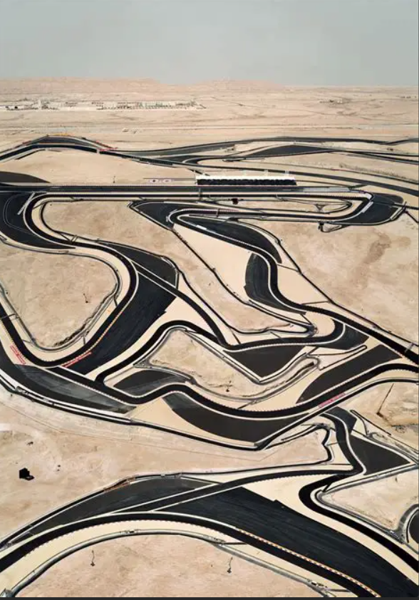
For the prupose of this exercise, we don't want classic leading lines, what we really want is 'mis-leading lines' ... ones that confuse, or take you away from the subject, or lead you into the image, but then straight back out again.
As in this image of the Bahrain Formula One race track. The confused jumble makes it difficult to know what you are looking at were it not for the title.
It could almost be something melting across the scene like a Salvador Dali ...
5 ... Leave Space for an Object to Move Into
Another rule beloved of camera club judges ... in this image Jesus has plenty of room to move forward towards St Mary's Pharmacy. The direction of travel is obvious and there is ample space to move into before running out of photograph. It is a very 'safe' composition.


In contrast is this image by Saul Leiter where the person walking with the umbrella has already moved through and has now run out of space. Some would say that the composition has tension, some would go so far as to say that it was jarring ... I'd call it interesting.
Typical of Saul's work, it it demonstrates his love of Japanese art, especially the woodblock prints of Ukiyo-e that became a heavy influence on the early French Impressionists such as Edgar Degas, Édouard Manet and Claude Monet, as well as influencing Post-Impressionists such as Vincent van Gogh, and Art Nouveau artists such as Henri de Toulouse-Lautrec.
Of course, anyone absolutely insisting that a person or animal always needs room to move into would do well to look at Behind the Gare Saint Lazare ... one of the most famous images of the twentieth century ... and nowhere for the man in question to go, other than down, into the puddle!

6 ... The Subject Needs to be in Focus

Robert Golden once said to me "be evocative, not descriptive" ... this is certainly something that comes to mind when you are looking at the work of club member Pete Millson.
This rule really doesn't need much in the way of introduction but perhaps some of you need to give yourselves permission to allow the subject to be out of focus.
After all, another image on that list of twentieth century icons wasn't exactly sharp!
The D-Day landings on Omaha Beach ...

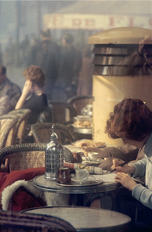
7 ... The Background Needs to be Sharp
f8 and be there ... that used to be the cry ... back in the days before autofocus when zone focusing ruled. And the result? Everything in the image was sharp, front to back, including the background. And because it usually was ... it's become expected in a lot of circles ... but ... by deliberately letting the background fall out of focus. This image, taken in Paris at the end of the nineteen fifties, starts to take on an almost painterly quality.
8 ... Don't Blow the Highlights
Areas of bright white with no detail tend to be very frowned upon, especially within camera club circles; but is it always wrong? Can the deliberate blowing of highlights add something to an image? It can certainly add an ethereal feel to a photograph ... this image by Trent Parke has blown highlights that give it a dreamlike quality, especially when you go on to notice the movement in the head on the right.

In fact, not only do we have blown highlights in this image, but we have blocked out blacks and a subject that is out of focus because of movement blur so this image could be described as 6,8.9.
9 ... Don't Block the Blacks
We are often told that black shouldn't really be black but should have detail in it, known as 'living black' ... despite one the stauncest proponents of using black black being one of the most infuentual photographers of all time. Ansel Adams developed the zone system for developing negatives into prints and said that each image should have pure black and pure white in them, then each of his prescribed zones in between.

Night photographers like Brassai let the shadows fall to black, as do photographers, like Weegee, that predominately used flash. Weegee was a New York ambulance chaser in the Thirties and Forties, and as such, a lot of his work is very graphic ... he would routinely turn up at crime scenes before the police and his unfettered acsess made for some astonishing images.
Feel free to go in search of this interesting photographer ... but here's an image of someone being shot from a cannon in order to show how the background can fall to black when using a flash.
Another image that came up during discussion was a picture of the Worlds Fair by Martin Munkaksi ... this one also has has blown highlights and is shot on the wonk.
Breaking three rules, it could be described as 2,8,9.
10 ... Use a Standard Crop and a Standard Form of Mounting or Presenting Your Image
A standard crop would be 6:4 (the ratio of 35mm film or a full frame digital camera), 1:1 (square and apes the classic 6X6 format used in medium format photography) or 3:4 used by modern crop sensors ... use something else.
But what about round? Our lenses are round, they produce a round image ... the reason that early negatives were square is because the camera body was made of wood, and a wooden box is a lot easier to produce ... although they never had much trouble producing drums but there you go!
Club member Alison Webber used round images to represent her childhood memories of looking through a seaside telescope ...


Vertical letterbox images are frequently found in Japanese art ... not so much in the European tradition but it works.
This woodblock print, Niwaka Ame (Sudden Rain), by Hirowaki (Shotei) Takahashi shows people trying to shelter by the bridge during a sudden storm.
It is easy to see the line between this and the image we looked at earlier by Saul Leiter of the woman with the red umbrella.

We tend to present work in a standard 400 X 500 mount, with the work in the centre.
The Mughol tradition often presented work that was mounted to one side.

Sometimes work is presented as escaping the image ... making it's way onto the surrounding mount.
This can be found in both Moghul and Persian art.
Club member Chris Hilton has used this method in the past, particularly in relationship to the gas pipes of Uzbekistan ...

And here's food for thought, we once had a creative comp where a member, Jill Hunt, took an abstract photo of a river bed, had it printed onto velvet, stitched it into a lampshade then presented it as her entry, flicking the switch to illuminate it as it was placed at the front.
Be as creative as you want with your presentation but please ... if you are going to do something 'off the wall' ... let us know in advance so that we can accomodate you.

11 ... Don't Cut Body Parts Off with the Edge of the Frame (especially heads)
If there is anything that annoys a photography judge it's having things cut off at the edge of the frame.
But if it's good enough for William Klein ... it's good enough for us!
Enjoy it ... and aim to produce something that no-one has ever seen before!


